
How to Create an Epic 80s-Inspired DTF Design: A Step-by-Step Guide
Creating eye-catching designs for custom apparel has become easier than ever. DTF (Direct-to-Film) printing brings your wildest design ideas to life on shirts, hoodies, and more. This guide walks you through making an amazing 80s-style design that mixes anime and rock music. Think neon colors, retro textures, and bold graphics that pop off the fabric.

Table of Contents
- What is DTF Printing?
- The 80s Aesthetic: Bold Colors and Retro Vibes
- Getting Started: Setting Up Your Design Canvas
- Converting to Black and White: Building Your Foundation
- The Hard Mix Blend Mode: Creating Bold Contrast
- Fine-Tuning with Black and White Adjustment
- Enhancing Details for Professional Results
- Adding Character with Grain and Texture
- Bringing in the Neon: Strategic Color Application
- Advanced Color Techniques
- Adding Personality with Design Elements
- The Final Touch: Vintage Texture Magic
- Why This Works for DTF Printing
- Tips for Design Success
- Making Your Design Stand Out
What is DTF Printing?
DTF printing is a modern way to put designs on clothes. The process is simple but powerful. First, you print your design on special film using bright inks. Then you add sticky powder on top while the ink is still wet. After heating the film to melt the powder, you press it onto fabric with a heat press machine.
This method works on almost any fabric - cotton, polyester, leather, and more. Unlike other printing methods, DTF doesn't need any special treatment on the fabric first. The colors stay bright and bold, even after many washes. Best of all, you can print detailed designs with lots of colors without extra costs.
The 80s Aesthetic: Bold Colors and Retro Vibes
The 1980s brought us some of the most memorable design styles ever seen. Neon colors ruled everything from movie posters to album covers. Pink, blue, purple, and yellow glowed like electric signs. Geometric shapes, chrome effects, and tropical themes filled designs everywhere.
This decade also saw anime becoming popular in Western culture. Shows mixed with rock music created a unique crossover style. Think of how bands used bright colors and cartoon-like graphics on their merchandise. This mix of Japanese animation and Western rock created something totally new.
The 80s look still influences modern designers today. People love the bold, confident feeling these designs create. They remind us of a time when everything seemed possible. Using this style for DTF printing gives your custom apparel that same exciting energy.
Getting Started: Setting Up Your Design Canvas
Open Photoshop and create a new document that's 12 by 8 inches at 300 DPI. This size works perfectly for DTF transfers and gives you room to create bold designs. Higher resolution ensures your final print looks crisp and professional on fabric.
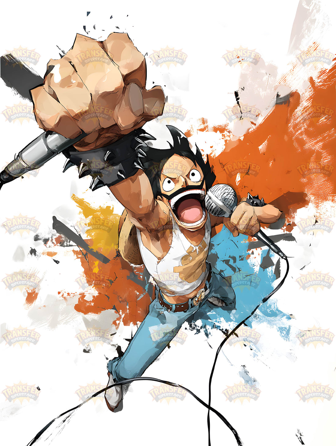
Choose a design idea that fits the 80s vibe. The tutorial features Freddie Mercury's iconic pose mixed with Luffy's anime-style face. This crossover concept works because both characters share bold, confident personalities. Mercury's rock star energy matches Luffy's determined spirit perfectly.
Start with good reference images. Find clear photos that show strong lighting and shadows. These details will help create the dramatic look that makes 80s designs so powerful. The fisheye angle mentioned in the tutorial adds that "shonen" anime intensity that makes characters look larger than life.
Converting to Black and White: Building Your Foundation
Switch your design to black and white using the "Black and White" adjustment layer in Photoshop. This step is important because it strips away distractions and helps you focus on values. Values are the range of light and dark in your image, which create the dramatic contrast that makes 80s artwork pop.
By removing color early, you can see where to place shadows and highlights. It also makes your design look more graphic and bold. These high-contrast black-and-white images were a major part of 80s poster art and album covers.
The Hard Mix Blend Mode: Creating Bold Contrast
Next, apply the Hard Mix blend mode. This effect turns soft gradients into sharp, poster-like areas of black and white. It's perfect for creating that gritty, high-energy look of 80s graphics. Suddenly, your design will look like it was screen-printed on paper or painted on a wall.
At first, the effect may look harsh, but that's exactly the point. 80s designs weren’t about being subtle. They were loud, in-your-face, and unapologetic. Hard Mix gives your design that same rebellious energy.
Fine-Tuning with Black and White Adjustment
Go back to your black-and-white adjustment layer. Use the sliders to control how each color translates into grayscale. This gives you precise control over which areas turn dark and which stay light. For example, you might want skin tones lighter but clothing darker for better separation.
This step helps bring balance to your design. You don’t want the whole image too dark or too light. The right mix of tones keeps your design readable while maintaining bold contrast.
Enhancing Details for Professional Results
Zoom into your design and look for areas where details get lost. Use adjustment layers or brushes to bring back important features. For example, make sure eyes and facial expressions stay clear. Sharpen edges that look too soft.
Professional-quality designs always pay attention to small details. These adjustments make the difference between an amateur design and one that looks like it belongs on a concert poster.
Adding Character with Grain and Texture
The 80s style wasn’t clean and digital—it had grit. Add noise or grain to your design to mimic that analog feeling. Photoshop’s "Add Noise" filter works well here. Keep it subtle, but enough to break up flat areas of color.
This gives your design a more natural, vintage quality. When printed with DTF, the texture adds depth and interest to the fabric. It feels authentic, like something made in the 80s rather than on a modern computer.
Bringing in the Neon: Strategic Color Application
Now it’s time to reintroduce color. Create new layers and start adding bold neon shades. Use bright pinks, electric blues, and glowing yellows. Apply them strategically to highlight areas you want to pop, like outlines or dramatic shadows.
Neon colors were everywhere in the 80s, but they worked best when paired with dark backgrounds. Try placing neon highlights against black areas for maximum contrast. This makes your design glow with energy, like a neon sign at night.
Advanced Color Techniques
Experiment with gradient maps and selective color adjustments. These tools let you shift entire ranges of colors at once. For example, you can push midtones toward purple while keeping highlights yellow. This creates that surreal, otherworldly feeling common in 80s designs.
You can also try duotone effects, limiting your design to just two bold colors plus black. This creates a striking, screen-printed look that works especially well for DTF printing.
Adding Personality with Design Elements
Don’t stop with just your main subject. The best 80s designs were full of personality. Add geometric shapes, lightning bolts, grid patterns, or retro typography. These elements turn a simple portrait into a complete artwork that tells a story.
Keep the layout dynamic. Place elements at angles or overlapping each other. The goal is to create controlled chaos that feels energetic and alive.
The Final Touch: Vintage Texture Magic
Overlay a vintage paper texture or screen-print effect. This makes your design feel authentic, like it was pulled from an 80s poster bin. Lower the opacity of the texture so it enhances without overwhelming the artwork.
This last step ties everything together. Your design will look finished, polished, and ready for print.
Why This Works for DTF Printing
DTF printing handles bold colors and strong contrasts exceptionally well. The neon shades remain bright, and the details stay sharp. Textures print beautifully on fabric, adding extra depth to your designs. Unlike screen printing, you don’t need multiple color separations—the printer handles it all.
This makes DTF the perfect match for 80s-inspired designs. It captures the era’s wild energy without losing any detail.
Tips for Design Success
• Keep your design high resolution (300 DPI).
• Use neon colors strategically—too much can be overwhelming.
• Test small prints before running a large batch.
• Pay attention to fabric color. Dark fabrics make neon pop, while light fabrics give a softer effect.
Making Your Design Stand Out
In today’s crowded market, unique designs get noticed. By combining anime influences, rock-and-roll energy, and 80s aesthetics, you create something fresh yet familiar. This blend speaks to nostalgia while still feeling modern.
DTF printing lets you experiment freely without technical limitations. Whether you’re designing for personal projects, band merchandise, or fashion lines, this method ensures your artwork makes a lasting impression.
Ready to Embark on your DTF Journey?
Experience DTF Excellence Today! Get your Sample Pack! See the vibrant colors, durability, and precision we offer firsthand before you invest.
Transform Your Style with our DTF Collection!
Ready to Elevate Your Printing Game? Submit your custom order now and experience:
- Superior color accuracy
- Premium durability
- Fast turnaround times
Click here to start your DTF printing journey!